Norsk Hydro ASA
ALUMINIUM
Düsseldorf
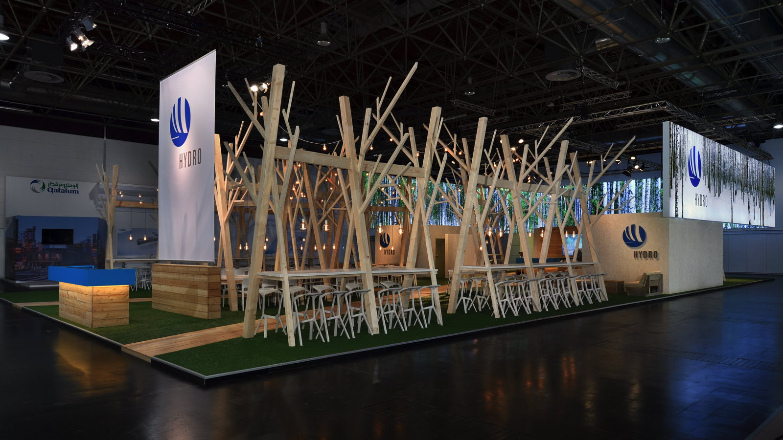
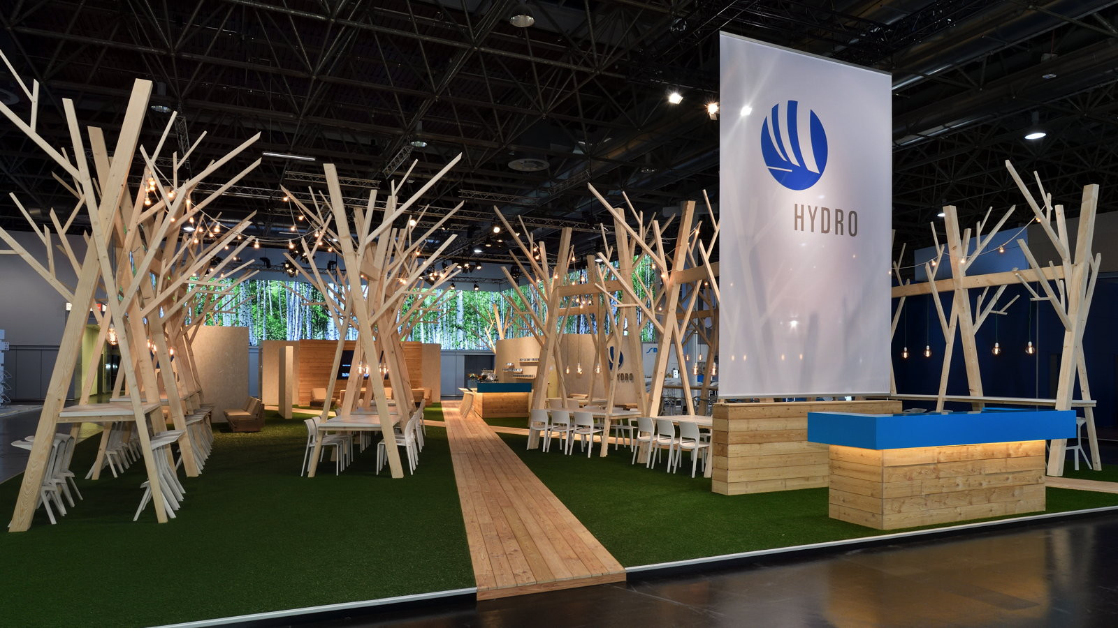
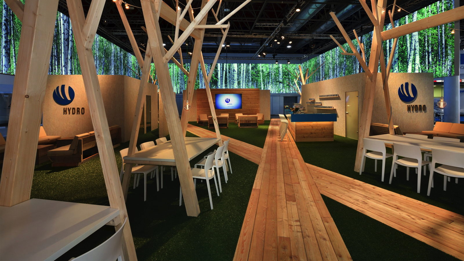
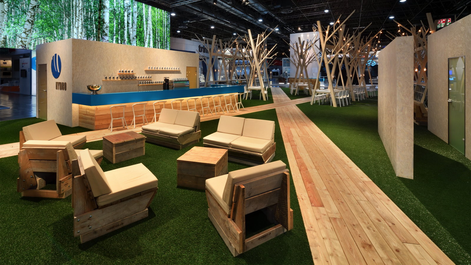
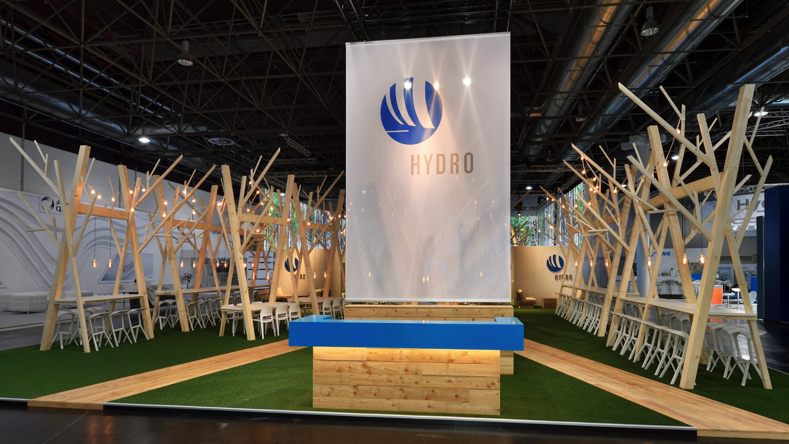
Minimalism Meets Nature – The Staging of Norsk Hydro
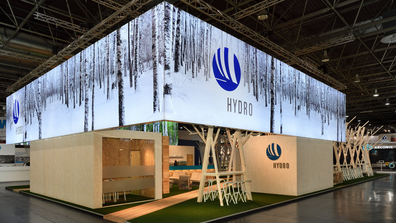
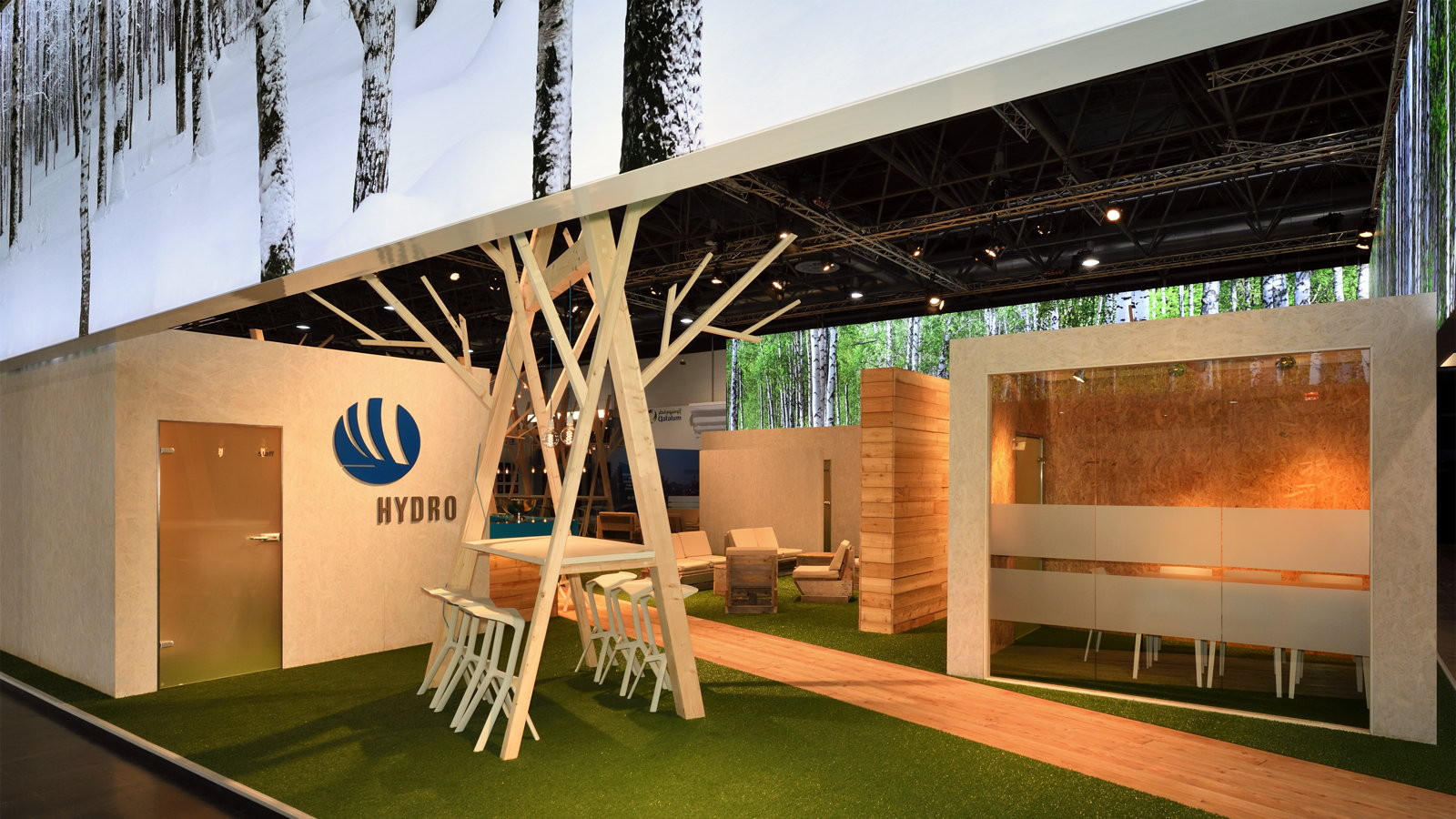
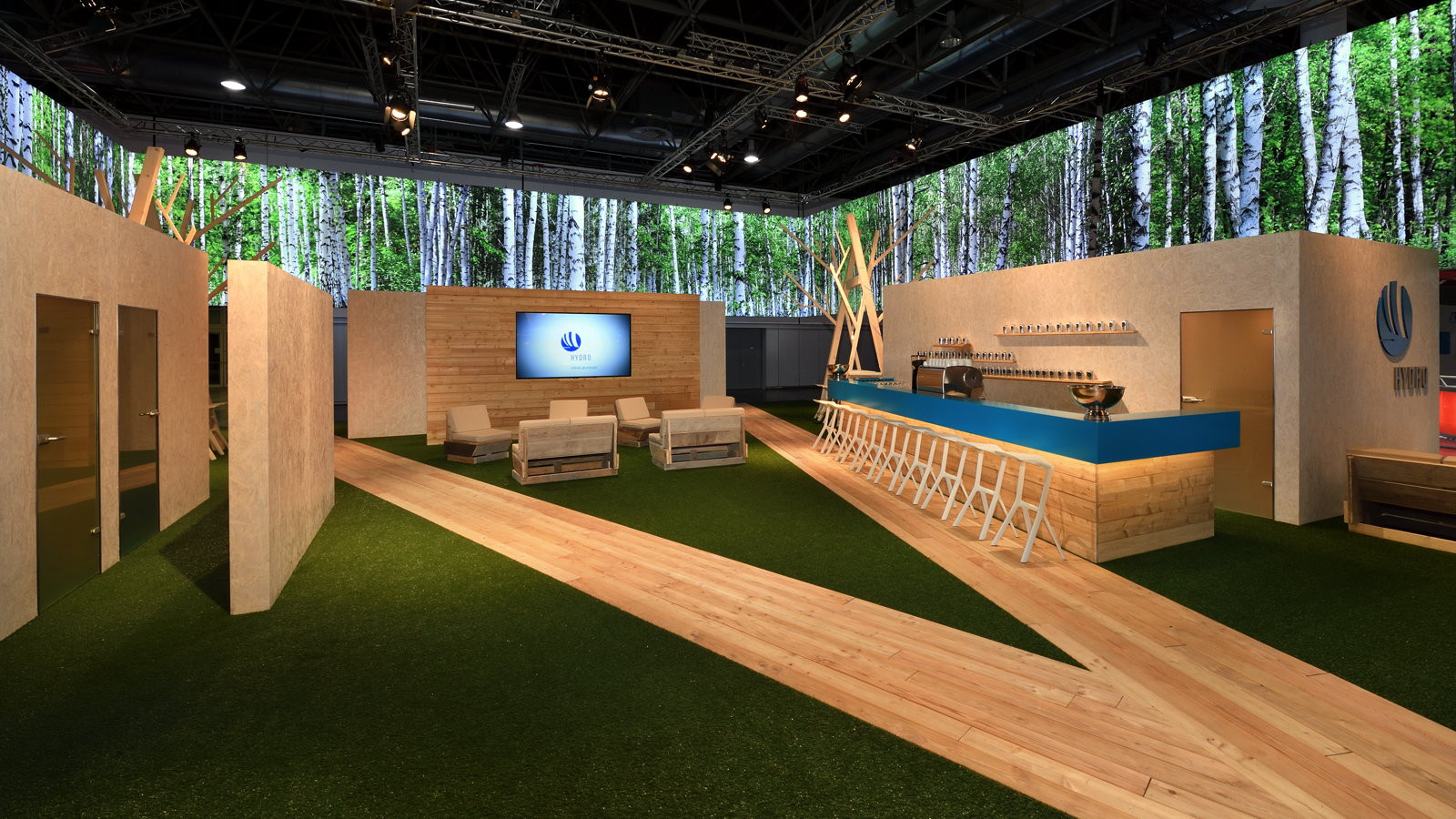
Norsk Hydro’s presence at the ALUMINIUM trade fair stood out for its "Nordic Simplicity" in perfection. Rather than relying on heavy construction elements, we focused on lightness and natural materials. The island stand invited visitors to explore the brand along wooden boardwalks that harmoniously wound through a lush green meadow area. This deliberate reduction to the essentials created a calming atmosphere within the hectic trade fair environment. Strategically placed meeting points, framed by wooden tree sculptures, provided the ideal setting for high-quality networking and underscored the company’s innovative strength.
Authentic Materials and Radiant Accents
The functional layout of the stand was solved through the use of uncoated OSB boards in the retreat areas, creating a look that was both natural and modern. Floating above these zones was an impressive lighting architecture, featuring double-sided prints that themed the seasonal contrast of Scandinavian birch forests. These lighting elements served not only as a landmark in the hall but also strengthened the emotional connection to the Hydro brand. The consistent color concept – ranging from natural wood aesthetics to the striking Hydro Blue of the info counters – ensured a cohesive and unmistakable brand image.